« Previous Essay
Rauschenberg, Looking Long and Thinking Hard
Next Essay »
Rock Paper Scissors: Materiality, Process, Society
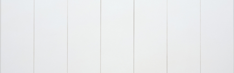
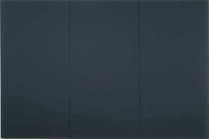
CAT. 58 Robert Rauschenberg (1925–2008), White Painting [seven panel], 1951 (detail)
Robert Rauschenberg began attending Black Mountain College in North Carolina in the fall of 1948 with the artist Susan Weil, whom he met earlier that year while studying at the Académie Julian in Paris on the GI Bill.1 Black Mountain had been founded in 1933 by John Andrew Rice, a Rhodes Scholar and a liberal educator, who focused the college on the arts, eventually attracting an impressive array of distinguished faculty and students in photography, poetry, literature, dance, music, architecture, and art.2 Rice fostered an atmosphere of experimentation that included a curriculum encouraging students to move through the program and graduate at their own pace. This liberal attitude brought Black Mountain to the attention of some of the most progressive intellectuals in the United States, as well as European artists like Josef and Anni Albers of the Bauhaus, who immigrated to the U.S. soon after the Nazis closed the Berlin Bauhaus in 1933. That November, Albers was appointed head of the painting program at Black Mountain, and Rauschenberg would become his student fifteen years later.
Rauschenberg first read about the college in Time magazine upon his return from Paris. The article referred to Albers as a teacher noted for being “the world’s greatest disciplinarian,” who taught Bauhaus experimental principles, including preliminary training in form, material, and color, as well as relationships among rectangles of various monochrome hues.3 Eager to hone his craft, Rauschenberg arrived at Black Mountain ready for discipline and instruction from Albers, who took an immediate dislike of him. “I was Albers’s dunce, the outstanding example of what he was not talking about,” Rauschenberg explained, adding:
He’d pick up something of mine and say, “This is the most stupid thing I have ever seen, I dun’t even vant to know who did it.” If I hadn’t had such great respect for him I could never have put up with the treatment.4
In fairness to Albers, as Martin Duberman writes, it was Weil who “had been considered more of a serious painter . . . though everyone had been amused at [Rauschenberg’s] childlike charm, his whimsical designs, his imaginative costumes, his vats of dye that cooked on the kitchen stove — and the violet underwear that emerged from them. But Albers, for one, had found Rauschenberg frivolous and told him he ‘had nothing to teach him.’”5
Despite Albers’s exasperation, Rauschenberg spoke of the artist favorably, calling him a “beautiful teacher and an impossible person,” and explaining that he continued to learn from Albers “years later.”6 Rauschenberg even partially credited Albers with inspiring the idea for what would become his White Paintings, begun in 1951, and his interest in monochromes may be derived, in part, from Albers’s schooling. Rauschenberg said that Albers instilled in him “such respect for all colors that it took years before [he] could use more than two colors at once.”7 Albers, however, did not return Rauschenberg’s appreciation, and years later he claimed that he could not remember Rauschenberg, who left Black Mountain in the summer of 1949.8 In January 1950, he began attending classes at the Art Students League in New York where he met Cy Twombly. That year, Rauschenberg also met the art dealer Betty Parsons, who offered him his first solo exhibition. It opened in May of 1951, and soon after Rauschenberg resumed his studies at Black Mountain. When he returned that June, Albers had departed to become the chair of Yale University’s Art Department.
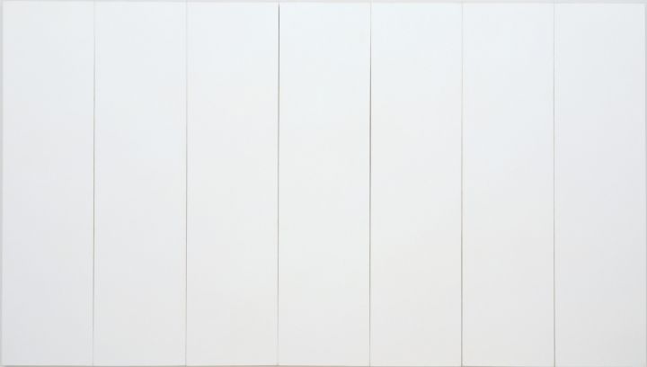
CAT. 58 Robert Rauschenberg (1925–2008), White Painting [seven panel], 1951. Oil on canvas, 72 x 125 inches (182.9 x 317.5 cm). Robert Rauschenberg Foundation, New York, New York. © Robert Rauschenberg Foundation / Licensed by VAGA, New York, New York.
That summer, Rauschenberg also began his Night Blooming series, which included eighteen primarily black paintings, and his White Paintings series. For the latter, he carefully covered a number of canvases with Benjamin Moore white paint.9 Each panel of the mostly multi-paneled paintings was exactly the same size, covered with exactly the same paint, applied with a roller in exactly the same consistency. After finishing the White Paintings, Rauschenberg wrote to Betty Parsons:
I have since putting on shoes sobered up from summer puberty and moonlit smells. Have felt that my head and heart have moved through something quite different than the hot dust the earth throws at me. the results are a group of paintings that I consider almost an emergency. they bear the contriditions [sic] that deserve them a place with other outstanding paintings and yet they are not art because they take you to a place in painting art has not been. (therefore it is) that is the the [sic] pulse and movement the truth lies in our pecular [sic] preoccupation. they are large white (1 white as 1 GOD) canvases organized and selected with the experience of time and presented with the innocence of a virgin. Dealing with the suspense, excitement and body of an organic silence, the restriction and freedom of absence, the plastic fullness of nothing, the point a circle begins and ends. they are a natural response to the current pressures of the faithless and a promoter of intuitional optimism. It is completely irrelevant that I am making them—Today is their creator.
I will be in N.Y. Nov. 1st and will forfeit all right to ever show again for their being given a chance to be considered for this year’s calendar.
Love Bob
I think of you often Brave
woman.
Hello to Monica.10
This letter conveys Rauschenberg’s powerful, emotional, and intellectual conceptualization of his White Paintings, which embodied for him a oneness and godliness comprised of “the plastic fullness of nothing” and “the point a circle begins and ends.” A number of his earlier works, particularly Mother of God (ca. 1950; fig. 3), anticipated the religious references in Rauschenberg’s letter. A collage/painting, Mother of God contains a fragment of text from the Catholic Review in its bottom corner that reads: “An invaluable spiritual road map. . . . As simple and fundamental as life itself.” This fragment reinforces an understanding of the many maps of U.S. cities with which Rauschenberg papered the surface and which could be interpreted as metaphorical representations of the multiple paths to God. It is possible that the cream-colored monochrome circle in the center of the painting also foretold the “1 white as 1 GOD” of the White Paintings.11
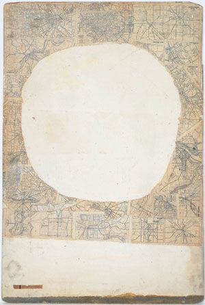
fig. 3 Robert Rauschenberg (1925–2008), Mother of God, ca. 1950. Oil, enamel, printed maps, newspaper, and metallic paint on Masonite; 48 x 32 1/8 inches (121.9 cm x 81.6 cm). Collection of the San Francisco Museum of Modern Art, California. Fractional purchase through a gift of Phyllis Wattis and promised gift of an anonymous donor. © Robert Rauschenberg Foundation / Licensed by VAGA, New York, New York.
Moving toward a secular reading of the work, Branden W. Joseph points out that when Rauschenberg was in New York during the summer of 1950, the art critic Clement Greenberg had lectured at Black Mountain on “Kantian aesthetics and the history of modernism.”12 Joseph’s assumption is that Greenberg’s teaching left a legacy at Black Mountain, for he instructed that the “one way to take painting where it had not yet been would be to pursue it further towards its ‘essential’ two-dimensionality.”13 While discussions of Greenberg’s theories may have found their way into Rauschenberg’s impulse to create the White Paintings and the subsequent matte-black paintings,14 the spiritual content of the White Paintings, as Rauschenberg laid them out for Parsons, distinguished the works significantly from Greenberg’s formalist concepts of the autonomy of art, even if Rauschenberg would soon cease talking about them in a spiritual way.
Moreover, Greenberg did not embrace the White Paintings, though he would accept that they were “art . . . albeit certainly not good art.”15 For many, the works were devoid of artistry, and after Rauschenberg exhibited them at the Stable Gallery in 1953, the critic Hubert Crehan wrote: “Their exhibition is a chef-d’oeuvre [masterpiece] of duck pressed to the point of no return. . . . White canvas . . . conceived as a work of art, is beyond the artistic pale.”16 For wholly different reasons, the White Paintings equally upset but also impressed the painter Ellsworth Kelly, who, upon seeing them for the first time in Rauschenberg’s studio in 1954, showed Rauschenberg sketches he himself had made in Paris between 1951 and 1952 of plain white monochromes, also in a series and also multi-paneled.
While the White Paintings even shocked some members of the progressive Black Mountain community,17 they deeply moved the composer John Cage, who met Rauschenberg in 1951 and became friends with the artist in 1952. Cage invited Rauschenberg to exhibit the White Paintings in what many consider to be the first “happening,” Cage’s Theater Piece No. 1 (1952), staged at Black Mountain.18 Cage organized the raucous production, arranging the audience seats “in the center of the performing area, facing each other, and broken by diagonals into four sections.”19 He invited Charles Olson and Mary Caroline Richards to read their poetry, Merce Cunningham to dance, David Tudor to play the piano, and Rauschenberg “to show his paintings and also to play recordings of his choice.”20 Cage stood on top of a ladder and read a text before descending to read it again from a lectern.21 Rauschenberg hung his White Paintings on the ceiling.
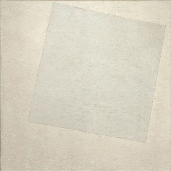
fig. 4 Kazimir Malevich (1878–1935), Suprematist Composition: White on White, 1918. Oil on canvas, 31 1/4 x 31 1/4 inches (79.4 x 79.4 cm). The Museum of Modern Art, New York, New York. 1935 Acquisition confirmed in 1999 by agreement with the Estate of Kazimir Malevich and made possible with funds from the Mrs. John Hay Whitney Bequest (by exchange). Digital Image © The Museum of Modern Art / Licensed by SCALA / Art Resource, New York, New York.
Galvanized and inspired by how the White Paintings absorbed shadow and light, Cage composed 4’33” (1952), the celebrated composition in which a pianist sits at the piano for four minutes and thirty-three seconds while the sounds of the concert hall provide the music. Cage remarked that he “must” compose 4’33” after being confronted with Rauschenberg’s radical monochromes, or else “I’m lagging, otherwise music is lagging.”22 A decade later, Cage devoted a chapter of his first book, Silence (1961), to Rauschenberg, whose White Paintings Cage described as “airports for the lights, shadows and particles,” which caught “whatever fell on them.”23 “Why did I not look at them with my magnifying glass?” Cage asked himself.24 According to Rauschenberg, Cage also considered the White Paintings to function like a “clock of the room”25 for how one could tell the time of day by reflections on their surfaces.26 In this regard, Joseph points out that the Hungarian Bauhaus master Lászlo Moholy-Nagy, an artist particularly admired by Cage, had written about Kazimir Malevich’s Suprematist Composition: White on White (1918; fig. 4) in his book The New Vision (1938). Describing how “the plain white surface . . . constituted an ideal plane for kinetic light and shadow effects which, originating in the surroundings, would fall upon it,” Moholy-Nagy even referred to the white square as “the final simplification of the picture.”27
Malevich had begun to move towards White on White already in 1913 when he introduced a drawing of a black quadrilateral on a white field (known as the “Black Square”) in his stage designs for Aleksei Kruchenykh’s Futurist opera Victory Over the Sun. In 1915 in Petrograd (now St. Petersburg) in the exhibition 0.10, the first showcase of his Suprematist paintings, Malevich presented Black Square (1915) and Red Square (1915),28 both quadrilaterals on a white field. Such works paved the way for White on White with its tilted white square on a white field.29 Three years later, the Russian artist Aleksandr Rodchenko arrived at the first monochrome paintings in his triptych Pure Red Color, Pure Yellow Color, Pure Blue Color (1921). “I reduced painting to its logical conclusion and exhibited three canvases: red, blue and yellow,” Rodchenko wrote in 1939. “I affirmed: It’s all over. Basic colors. Every plane is a plane, and there is to be no more representation.”30
Rodchenko’s conclusion that the monochrome signaled the end of representation could not have been more different than the supremacy of “pure feeling” that Malevich described of his Suprematist works in 1919 immediately following the Russian Revolution. Malevich wrote: “I have overcome the lining of the colored sky. . . . Swim in the white free abyss, infinity is before you.”31 Malevich pictured his interest in the Russian philosopher Peter D. Ouspensky’s metaphysical theories of time and motion, themselves inspired by the spiritual teachings of the Greek-Armenian George Ivanovich Gurdjieff, who philosophized about achieving higher states of consciousness. Given this history, many have interpreted Malevich’s square as a “spiritual icon.”32
Malevich’s point of departure was not dissimilar to Rauschenberg’s original understanding of his White Paintings as metaphysical and spiritual.33 Rauschenberg also grasped that his own monochrome paintings “deserve . . . a place with other outstanding paintings.” Moreover, Rauschenberg wrote that his White Paintings expressed his “natural response to the current pressures of the faithless and a promoter of intuitional optimism.” In this last statement, Rauschenberg threw down the gauntlet: he would pursue optimism in his work, no matter how discouraged he might feel in private.34 Rauschenberg would come to adopt Cage’s secular discourse about the White Paintings, but it is highly possible that he maintained his faith nonetheless.
Rauschenberg began his black paintings slightly earlier than the White Paintings, according to the curator and museum director Walter Hopps.35 The black paintings went through five phases. One of three surviving works from the first phase, Untitled (Night Blooming) (ca. 1951; see CAT. 57) is a work enlivened with broad brushstrokes atop a black background, evoking the night-blooming cereus plant under a sliver of moon.36 Like this work, other paintings in the Night Blooming series included gravel that adhered to the surface when Rauschenberg pressed the still wet, “pretty tacky” works onto the ground.37 The black monochromes of the second phase, exemplified by Untitled [matte black triptych] (ca. 1951; CAT. 56), were painted in flat black akin to the flat white of the White Paintings, and this example may even have once been a White Painting as, lacking funds, Rauschenberg often resorted to repainting his canvases during this period.38
CAT. 56 Robert Rauschenberg (1925–2008), Untitled [matte black triptych], ca. 1951. Oil on canvas, 72 x 108 inches (182.9 x 274.3 cm). Robert Rauschenberg Foundation, New York, New York. © Robert Rauschenberg Foundation / Licensed by VAGA, New York, New York.
Groups three and five of the black series were primarily painted in black applied over highly textured newspaper bases that had been dipped in glue to adhere to the canvas. Rauschenberg would then cover the newspaper with multiple layers of more thick black paint, and although identified usually as Untitled, these works are often subtitled “glossy black painting.”39 Though Rauschenberg understood black to be a color, it was also, as Nicholas Calas has written, “a condition in which paper, paint, ink, canvas are to be found.”40 “Careful not to confuse repainting with action,” Calas also observed that Rauschenberg “assemble[d] different blacks, placing a glossy one alongside a rough one, a thick one, or a torn one, and fit them over the surface of the canvas.”41 In group four, Rauschenberg often displayed the newsprint while still covering much of the canvas with black paint, as in Untitled (Asheville Citizen) (1952), whose surface reveals the newspaper in its lower center register. His combination of the “physical qualities of paint [and] the textural qualities of newsprint [produce] an opaque depth which extends his ‘palette,’” according to Lana Davis.42 Working thus in collage would soon lead Rauschenberg to his combine works two years later in 1954.43
After first exhibiting the black paintings (along with the White Paintings) at the Stable Gallery in 1953, many viewers experienced their color as “nihilistic, destructive, and outright terrible.”44 Disappointed by these negative interpretations, Rauschenberg insisted that neither series was narrative: “My black paintings and my White Paintings are either too full or too empty to be thought — thereby they remain visual experiences. These pictures are not Art.”45 With slight variation, Rauschenberg restated points that he made in his letter to Parsons in 1951: the works were “not Art” quite simply “because they take you to a place in painting art has not been.” Without antecedent, such objects had no reference within art to be considered as Art in Rauschenberg’s view. It is important to remember that Rodchenko’s revolutionary monochrome triptych was not known in the U.S. in 1951, and would only be discussed by scholars in the late 1960s or early 1970s.46
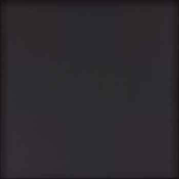
fig. 5 Ad Reinhardt (1913–1967), Abstract Painting, 1963. Oil on canvas, 60 x 60 inches (152.4 x 152.4 cm). The Museum of Modern Art, New York, New York. Gift of Mrs. Morton J. Hornick. © 2014 Estate of Ad Reinhardt / Artists Rights Society (ARS), New York, New York. Digital Image © The Museum of Modern Art / Licensed by SCALA / Art Resource, New York, New York.
Rauschenberg understood black and white to be colors. This view differentiated his monochromes from the black paintings of Ad Reinhardt, who titled them Abstract Paintings (1960–66; fig. 5) and would famously describe black as a “non-color.”47 Reinhardt had begun to move toward the use of a single color applied in a brick pattern of varying tones as exemplified by Number 107 (1950), a work comprised of several different values of white paint with brushstrokes in varying lengths and widths atop the underlying linen canvas. Reinhardt continued the brick forms with greater modularity into the black Abstract Paintings. Typically 60 by 60 inches, Reinhardt divided his black works into three horizontal and three vertical rows with nine subdivisions, and he painted each square in a variation of black mixed with blue, yellow, red, or green pigment. When first encountering the works, they appear black. But the subdivisions became more obvious after long viewing and, in this respect, are quite different from Rauschenberg’s earlier stark monochromes of 1951.
Rauschenberg’s vision was also different from that of Yves Klein, who in May of 1954 first presented monochromes in two books of prints, Peintures and Haguenault Peintures, which featured color plates of “single-colored rectangles,” each related to “a different place of creation: Madrid, Nice, Tokyo, Paris.”48 The following spring, Klein entered an orange painting, entitled Expression of the Universe of the Color Orange Lead, in the Salon des Réalités Nouvelles in Paris. The painting, known as Klein’s first monochrome, is signed in the lower right hand corner of the front of the work: “K. mai. 55.” Klein’s signature dramatically affects a view of the work as a monochrome, and Klein would immediately abandon this conceit, leaving the surfaces of his subsequent monochromes blank except for color. Regardless of the signature and the committee for the Salon des Réalités Nouvelles’s request that he add only “a small line,” the painting was rejected for being “not enough” and “impossible!”49
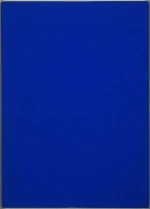
fig. 6 Yves Klein (1928–1962), Blue Monochrome, 1961. Dry pigment in synthetic polymer medium on cotton over plywood, 76 7/8 x 55 1/8 inches (195.1 x 140 cm). The Museum of Modern Art, New York, New York. The Sidney and Harriet Janis Collection. © 2014 Artists Rights Society (ARS), New York, New York / ADAGP, Paris, France. Digital Image © The Museum of Modern Art / License by SCALA / Art Resource, New York, New York.
Five months later, Klein had his first public exhibition of monochromes, Yves Peintures, in the private salons of the Lacoste publishing house. There he also distributed a text describing his concepts for “single color” paintings, based on “research” that had led him,
to believe that there is a living world of each color [which] in some way [is] an individual, a being who is not only from the same race as the base color, but who definitely possesses a distinct character and personal soul . . . [and] definitely a “presence,” a living being, an active force which is born and dies after having lived a sort of drama of the life of colors.50
The following February of 1956, after Colette Allendy exhibited Yves, Propositions Monochromes, Klein began to be widely associated with monochrome painting.
In 1957, Klein developed and patented International Klein Blue (IKB), leading to his Blue Monochrome paintings (fig. 6), eleven identically formatted works, uniformly painted in IKB that he exhibited in Proposte monocrome, epoca blu at the Apollinaire gallery in Milan. In an essay on the works, titled “THE MINUTE OF TRUTH,” the French critic Pierre Restany described the monochromes as “phenomena of pure contemplation” and a “highly enriching cure of asthenic silence.”51 Klein also claimed in 1957 that “around 47–48, I created a ‘monotone’ symphony whose ‘theme’ is what I wished my life to be.”52 The striking similarity between Klein’s Monotone Symphony and Cage’s 4’33” (1952) is worth remarking, especially as Klein presented the first performance of the symphony in 1961, in the context of a live performance of his Anthropométries, consisting of nude models covered with IKB paint who imprinted their bodies on canvas.53 The combination of the symphony and the monochromes bear a striking resemblance to the pairing of Cage’s inspiration for 4’33” and its inspiration: Rauschenberg’s 1951 White Paintings.
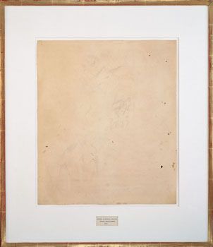
fig. 7 Robert Rauschenberg (1925–2008), Erased de Kooning Drawing, 1953. Traces of drawing media on paper with label and gilded frame, 25 1/4 x 21 3/4 inches (64.1 cm x 55.3 cm). Collection of the San Francisco Museum of Modern Art, California. Purchase through a gift of Phyllis Wattis. © Robert Rauschenberg Foundation / Licensed by VAGA, New York, New York. Photo by Ben Blackwell.
Unlike Klein, Rauschenberg insisted on the materiality of his monochromes: “I wanted to show that a painting could have the dignity of not calling attention to itself, [and] that it could only be seen if you really looked at it.”54 In his black paintings, as Andrew Forge points out, “There was much to see but not much showing. . . . In [them] there was none of the familiar aggressiveness of art that says: ‘Well here it is, whether you like it or not.’”55 Rauschenberg also unveiled black as a deep and glorious, reflective color, demonstrating his “growing conviction that a work of art need not remain fixed and unchanging.”56 Rauschenberg further explained: “I did them as an experiment to see how much you could pull away from an image and still have an image. . . . How far can you push something that doesn’t have a center?”57
What few realize is that the White Paintings prompted Rauschenberg to want to make monochrome drawings. But, the challenge of blankness proved difficult to render. He reasoned that only through an erasure would this be possible and that erasing his own drawing “wasn’t art yet.”58 He felt that he must erase a drawing that was already “art,” and settled on asking Willem de Kooning since he was “the best known acceptable American artist” and his work would be “indisputably considered art.”59 “I bought a bottle of Jack Daniels,” Rauschenberg remembered, “and knocked on de Kooning’s door.” After explaining his concept, the abstract expressionist replied: “Okay, I don’t like it, but I’m going along with it because I understand the idea.”60 Determined to make Rauschenberg’s task as difficult as possible, de Kooning selected a drawing that he would “miss,” full of charcoal, pencil, and crayon. It took Rauschenberg about a month to erase the work with an unknown quantity of erasers. Some viewers argue that Erased de Kooning Drawing (1953; fig. 7) is the defilement of an artist’s work. But for Rauschenberg the work was “a celebration,”61 one that he christened “monochrome no-image,”62 a term that, while rarely cited, offers an opportunity to think about the monochrome in an expanded field.
That same year, Rauschenberg began making red monochromes full of visual detail that, following his “monochrome no-image” erasures, Kristine Stiles has suggested might be labeled “monochrome with-image.”63 Such a monochrome might contain any number of types of images, from figurative and abstract forms to textures and words, while still maintaining an overall monochrome appearance. But the “monochromes with-image” would move away from a stress on the visual to include topical subject matter. Rauschenberg’s Litercy (1991; see CAT. 87), from Rauschenberg’s Phantom series, might best be described as a monochrome with-image for its silvery-violet shimmering surface that reflects viewers as they interact with “Bob’s Hand,” the text Rauschenberg transferred from photographs onto the work.
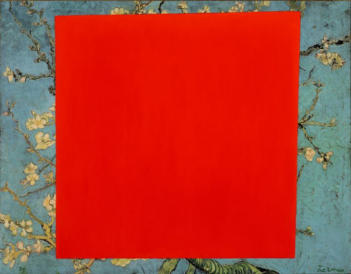
CAT. 44 Leonid Lerman (b. 1953), Improvisation in Red and Blue, 1993. Oil on offset print, 32 3/4 x 40 inches (83.2 x 101.6 cm). Collection of the Nasher Museum of Art at Duke University, Durham, North Carolina. Museum purchase, 1995.14.1. © Leonid Lerman. Courtesy McKee Gallery, New York, New York. Photo by Peter Paul Geoffrion.
So, too, might the Russian artist Leonid Lerman’s Improvisation in Red and Blue (1993; CAT. 44) be considered a monochrome with-image, as one of the many works in his The Phantom Malevich series. In this work, Lerman painted a representation of Malevich’s red quadrilateral from Suprematist Composition: Red Square (1915) over an appropriated section of Vincent van Gogh’s Blossoming Almond Tree (1890). Meditating on the heritage of the Russian avant-garde, Lerman wanted “to test” Malevich’s “cosmic” concept against “the very heart and vibrancy of landscape painting.” He selected a van Gogh for its “energy, warmth and humanity” and juxtaposed it with Malevich’s Suprematist red square.64 Lerman also turned to the Russian landscape painter Isaac Levitan, who he compared to “Chekhov and Dostoyevsky” for Levitan’s ability to convey the mood of a deeply felt landscape. Blending Levitan and Malevich, Lerman sought a greater “unity” of abstraction and representation, thereby producing the “monochrome with-image” in dialogue with Rauschenberg’s concept of the “monochrome no-image.”
The monochrome with-image plays a critical role in Vitaly Komar and Alexander Melamid’s Stalin with Hitler’s Remains (1985–86; see CAT. 40), a painting that belongs to their Anarchistic Synthesism series, in which the artists focused on appropriating various stylistic trends from the pluralism of the 1980s.65 Having immigrated to the U.S. in 1978, Komar and Melamid quickly began to focus on the art world around them in New York. In Stalin with Hitler’s Remains, they hinged a monochrome white panel to the bottom of the socialist realist painting above, adding the work’s title in small lettering in the center of the monochrome. Juxtaposing figuration and abstraction and nodding to the conflict between the governments of the Soviet Union and the United States, Komar and Melamid’s anarchistic synthesis “satirized the New York style wars,” as much as it simultaneously acknowledged painters who painted white monochromes from Malevich and Rauschenberg to Robert Ryman.66
The Russian artist Yuri Albert’s About Beauty (1988–89; CAT. 2), from his Alphabet for the Blind series, is a stark black monochrome that contains a Braille inscription reading “About Beauty.” While in principle related to Rauschenberg’s White Paintings and matte-black paintings, Albert’s monochrome may also be understood as a monochrome with-image for its textual and visual embellishment.67 One of nine works in the series Alphabet for the Blind, Albert initiates a string of paradoxical negations in this work. Although intended for the blind living in semi-blackness, the work’s elite status in a museum collection prevents it from ever being touched and therefore read. Thus, the work — for the blind — remains completely inaccessible, available only to conceptual discourse in the narration of its visual and textual properties. For those with eyes, but who do not know Braille, the artist’s meaning remains equally elusive.
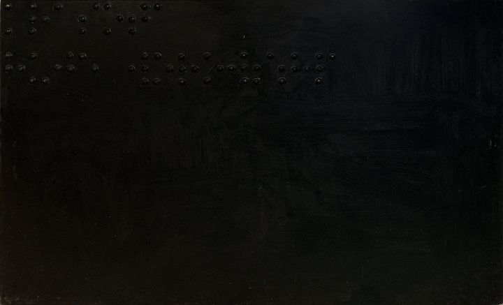
CAT. 2 Yuri Albert (b. 1959), About Beauty from the series Alphabet for the Blind, 1988–89. Paint on Masonite, 48 x 79 3/4 inches (121.9 x 202.6 cm). Collection of the Nasher Museum of Art at Duke University, Durham, North Carolina. Gift of 17 Contemporary Russian Artists, 1995.16.1. © Yuri Albert. Photo by Peter Paul Geoffrion.
Braille on a monochrome serves as a multiple signifier for the highly conceptual status of the monochrome in the history of art. Moreover, by virtue of appearing on a monochrome, the Braille text may index the frequent incomprehensibility of monochrome painting even among elite audiences. Associated with Moscow Conceptualists, Albert’s work is also involved with researching “relationships between an artwork and its interpretation, art production and art consumption, labor costs and instant effects, between the visible and the invisible in art.”68 In this regard, Ekaterina Degot suggests that Albert’s work poses the following questions:
What does it mean to be a viewer? What do we see, when we visit a museum? And what remains outside our field of vision? How do we interpret the artist’s message? What does it mean to understand it correctly or incorrectly?69
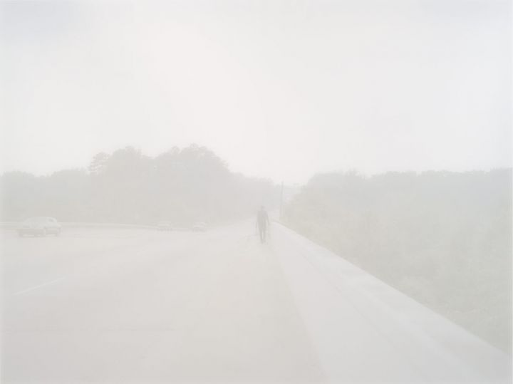
CAT. 35 Paul Graham (b. 1956), Man walking with blue bags, Augusta from the series American Night, 2002. Lightjet Endura chromogenic print, edition 3/3, 74 5/8 x 93 7/8 inches (189.5 x 238.4 cm). Collection of the Nasher Museum of Art at Duke University, Durham, North Carolina. Gift of Floyd H. Bradley III and Martha Hummer Bradley in honor of Floyd H. Bradley, Jr. (T’45) and Carol Lake Bradley (WC’43), 2010.11.1. © Paul Graham. Courtesy Pace Gallery and Pace / MacGill Gallery, New York, New York.
Similar to Albert, the British photographer Paul Graham takes up the trope of blindness as a form of social commentary in his series American Night (1998–2003). Working exclusively in large-scale photographs, Graham chronicled American life, attending to American poverty, as seen during his travels throughout the United States.70 Many of the images appear as if in a thick fog such that their figuration becomes so faint that it disappears into a work that is nearly monochromatic.71 Man walking with blue bags, Augusta (2002; CAT. 35) displays such an effect; through the dense whiteness of the image, one can just see a man that appears to be walking along a road lined with trees. The social implications of Graham’s bleached-out images suggest that the urban poor, often brown and black, are “invisible to majority-white America.”72 The bright photographs have also been interpreted as “rejecting the photographic tradition of using darkness and shadow to reflect poverty or deprivation.”73
It is impossible to confirm if the content of the newspaper articles that Rauschenberg transferred onto the gossamer fabrics of his Hoarfrost series address social issues, but a work like Untitled (1975; see CAT. 77) has an illusory, haunting quality not unlike Graham’s photograph and may index similar content impossible to access both because the transfer images are so faint and because many are under layers of fabric. Nonetheless, the distinct melancholy of Untitled (Hoarfrost) speaks to similar qualities in Graham’s Man walking with blue bags, Augusta.
CAT. 11 Bruce Conner (1933–2008), UNTITLED D-1 (INK DRAWING MADE TO BE HUNG IN THE SUN TO DISAPPEAR OVER TIME), 1965–71. Black felt-tip pen on paper, 29 3/8 x 23 7/8 x 3/4 inches (74.6 x 60.6 x 1.9 cm). Nasher Museum of Art at Duke University, Durham, North Carolina. Promised gift of anonymous donor, L.13.2012.22. © Conner Family Trust, San Francisco, California / Artists Rights Society (ARS), New York, New York.
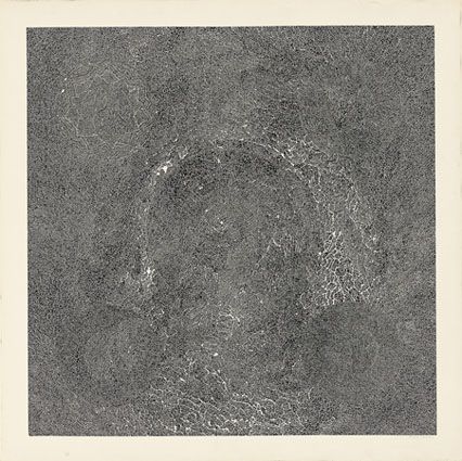
While Rauschenberg accepted the place of light in shadows on his black and white monochrome paintings, Bruce Conner rejected the effect of light on his black and white mandala drawings. With one exception: Conner used the action of light on UNTITLED D-1 (INK DRAWING MADE TO BE HUNG IN THE SUN TO DISAPPEAR OVER TIME) (1965–71; CAT. 11), a drawing belonging to his mandala series, as a visual corollary to events and emotions in time. In May of 1980, Conner gave the work as a wedding present with the precise verbal instructions: “Hang the drawing in the sun, because the image will last only as long as your marriage.” When the marriage ended after fifteen years and Conner subsequently saw the still intact drawing, he remarked: “You did not hang it in the sun, but I was right.” The owner had deliberately placed the drawing in the darkest place in her home, which is why a faint image remains today.74
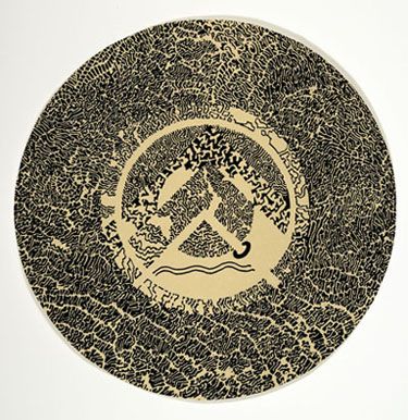
CAT. 23 Bruce Conner (1933–2008), Lower center element from SAN FRANCISCO DANCERS’ WORKSHOP POSTER, 1974. Offset lithograph on paper, 8 1/2 inches diameter (21.6 cm). Nasher Museum of Art at Duke University, Durham, North Carolina. Promised gift of anonymous donor, L.13.2012.9. © Conner Family Trust, San Francisco, California / Artists Rights Society (ARS), New York, New York.
Conner’s mandala drawings originated in Mexico, where he moved in 1962 with his wife, the artist Jean Sandstedt Conner, and their baby son Robert, fearing what appeared to be impending nuclear war.75 Conner spent most of his time in Mexico drawing, as paper was inexpensive and portable.76 He also began using peyote during this period, although he strongly maintained that he never made art while using drugs, as it would be impossible to draw with the precision demanded by his technique.77 Though he created his first mandala drawing in 1963, one work that suggests the influence of his Mexican experience is the hybrid SAN FRANCISCO DANCERS’ WORKSHOP POSTER (1974; CAT. 23). The unique drawing has pyramid-like triangles that interpenetrate circles and is decorated with forms reminiscent of Pre-Columbian art and architecture. Such ornate markings make up the middle ground, morphing into a triangular shape at the top, circular at the base, and punctured by a blank line that creates yet another triangle, one leg of which is surrounded by a ring. Conner created this work as a poster design for the San Francisco Dancers’ Workshop founded by pioneer of modern dance Anna Halprin. He appropriated parts of the drawing for the cover of Halprin’s Collected Writings (1974).78
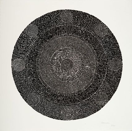
Conner devoted eight months to his first mandala drawing, 23 KENWOOD AVENUE (1963), on which he worked for up to ten hours a day.79 Other examples are the extremely complex drawing #100 MANDALA (1970; CAT. 14) and the smaller scale circular drawing #115 (ca. 1970–74; CAT. 15). For such works he would sit at his drawing table for hours, using pens to create small, exact ink marks on paper and never allowing the marker to cross over an existing line.80 Both works are intricate and delicate, exemplifying Conner’s meticulously detailed method of drawing and his effort to find a technique through a “sort of automatic consciousness . . . to work on a drawing to the point that awareness is happening with the hand, and the eye, and the entire body in relation to the paper [as] it would progress as a thought form across the page.”81 No two lines are the same in any drawing, and “every stroke changes the work existentially even though the a priori structure is perforce predetermined.”82 Conner also considered that such “drawings existed as total and complete every time I’d put a mark on the paper and the marks would continue to change.”83
CAT. 14 Bruce Conner (1933–2008), #100 MANDALA, 1970. Offset lithograph on paper, edition 10/50, 29 1/2 x 29 1/4 inches (74.9 x 74.3 cm). Collection of the Nasher Museum of Art at Duke University, Durham, North Carolina. Anonymous gift in honor of Blake Byrne (T’57), 2012.7.2. © Conner Family Trust, San Francisco, California / Artists Rights Society (ARS), New York, New York. Photo by Peter Paul Geoffrion.
CAT. 15 Bruce Conner (1933–2008), #115, ca. 1970–74. Offset lithograph on paper, edition 8/85, 12 1/4 x 12 3/4 inches (31 x 32.2 cm). Nasher Museum of Art at Duke University, Durham, North Carolina. Promised gift of anonymous donor, L.13.2012.8. © Conner Family Trust, San Francisco, California / Artists Rights Society (ARS), New York, New York.
Also in 1963, Conner began to use the newly introduced Pentel felt-tip watercolor pens for his drawings in the hopes of halting their tendencies to fade.84 The Pentel pens were ideal for the execution of the mandala drawings, Conner maintained, because he never had to lift his hand from the paper and could work for hours at a time without taking a break. He would draw until the pen ran out of ink, an effect that can be seen in some of the drawings where black ink marks gradually give way to gray. Once the line becomes very light, it suddenly changes to black again, signaling that he had replaced the pen with a new one. Despite the initial hope that the marks from the felt-tip pens would endure, the drawings continued to dim over time. Exasperated, Conner commented: “Well, let me tell you about felt-tip pens. Felt-tip marker pens, which are labeled permanent, are not. They fade and disappear in sunlight.”85 Even though Conner drew undulating black forms, leaving a white ground in the mandalas, he also used the felt-tip to create abstract patterns in other works such as the zebra-like forms of #125 (1971; CAT. 18).
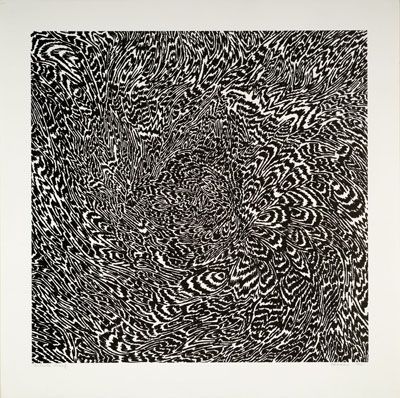
CAT. 18 Bruce Conner (1933–2008), #125, 1971. Offset lithograph on paper, artist’s proof, 14 1/4 x 14 1/4 inches (36.2 x 36.2 cm). Nasher Museum of Art at Duke University, Durham, North Carolina. Promised gift of anonymous donor, L.13.2012.14. © Conner Family Trust, San Francisco, California / Artists Rights Society (ARS), New York, New York.
Conner’s drawings occupied him for his entire career. By the end of his life, suffering from liver disease and declining a transplant, Conner was severely weakened and too debilitated to work on almost anything other than his drawings, so he spent his days creating intricate works at home. He would sit at a tiny desk that was his studio and he “would do what [he could there].”86 Later in his career, Conner spent much time working on his INKBLOT drawings, each of which, like the mandalas, follows a specific formula while still retaining unique qualities (see CAT. 3). The works would include precise lines and groups of inkblot shapes and would vary in density and size. Conner said that in his weak state he could make four or five inkblots before draining himself and needing to return to bed.87
Conner would eventually retitle 23 KENWOOD AVENUE, his first mandala drawing, THE NEW ROSETTA STONE, a reference to the ancient artifact containing the same text written in three different languages: Egyptian hieroglyphs, Demotic script, and ancient Greek.88 Able to read Demotic and Greek, scholars then deciphered the hieroglyphs, which had remained an enigma for centuries. By renaming his work THE NEW ROSETTA STONE, Conner gave it the importance of a groundbreaking archaeological discovery, implying that the work was a key to the languages of his own oeuvre, much in the manner that Rauschenberg’s letter to Betty Parsons served as an interpretive key for understanding the initiating languages of his art.
In addition, both Rauschenberg and Conner paid tribute to black and white as colors for visual meditation. Almost all of Conner’s works are rendered in black and white, because, as he put it, “[with color] the abstractness of the drawings becomes less so and it becomes . . . too decorative for me.”89 Also akin to Rauschenberg’s monochromes, Conner’s drawings are as much about his method as they are about the finished works. But Conner and Rauschenberg differed in how their work addressed the viewer. While for Conner the mandalas were “for the private eye, not the public eye,”90 for Rauschenberg, the monochromes were for the public. Regardless of this difference, both Rauschenberg’s monochromes and Conner’s mandalas require close examination. The more one contemplates, the more they reveal. With Conner’s mandalas, a new line or ink mark will suddenly pop into focus for a viewer, in a way similar to how one might notice a new shadow play on the surface of a White Painting, or how a subtle reflection in the glossy paint of a black painting might change how one regarded the work.
While it is a truism that no two people see art in the same way, this adage is even truer in the case of monochromes and mandalas, with their mysterious and simultaneous emptiness and fullness. Conner’s mandalas are filled with complicated, looping, winding, and circling lines and exact marks that, from afar, meld black and white into seas of monochrome gray, causing one to strain to see the variations in tone and the subtle circular forms throughout the works. As one draws closer, the extreme intricacy of the drawings becomes clearer, absorbing the viewer. Similarly, the monochromes are at first deceptively simple, but concentration reveals their surfaces to produce complex visual effects. In addition, neither monochromes nor mandalas have political associations, even as they both have a role in spiritual and meditative contemplation, freeing the mind and opening the imagination. A critic analyzing Conner’s drawings might equally have been musing on Rauschenberg’s monochromes when he or she wrote:
[The] drawings require the spectator to become a vicarious participant, moving close to the surface, becoming involved and consumed in their ambiguities of reference and scale, matte and glossy surface and subtlety of gesture and composition, qualities which command recognition at close range but which attenuate to gray blurs and reflections at a distance of more than a few feet.91
Conner concentrated on being present through the act of drawing, especially in rendering a mandala, which helped him to still his mind and permit “awareness [to be] happening with the hand, and the eye, and the entire body.”92 The mandala is a symbol of the cosmos, historically used as a meditation device, and it was linked to the Beat Generation’s interest in Eastern philosophy. This association led some to correlate Conner’s work with Buddhism, a comparison that Conner disdained for how it “limited” the mandala, which could “imply a universal concept” as the circle is “a common, universal, ordering structure, one of the most fundamental in the world.”93
Similarly, Rauschenberg’s monochromes have been connected to Zen, as they can be found in religions like Sufism where the monochrome is associated with “the realm of God” and given “special priority and meaning.”94 Like the mandala, the monochrome also evokes “Indian and tantric . . . objects of meditation.”95 But as Conner rejected such associations, so did Rauschenberg. Moreover, it was not Rauschenberg, but John Cage, who believed that a “white environment could evoke Zen-inspired contemplation.”96 Although Rauschenberg had already met Cage, he painted his monochromes before their friendship developed, and Rauschenberg never identified his monochromes with Eastern philosophy. “Yes,” Rauschenberg said, “John [Cage] used to tease me that he’d spent years studying Zen and that I was just naturally Zen.” But, Rauschenberg continued, adding the following critical point:
I’d never been particularly curious about what Zen is because I think to understand it is to not understand it. It’s beyond reason. But what it does is it gives you acres of intellectual airtime to wander around in.97
No concept better or more eloquently captures the essence shared by the monochrome and the mandala than that to think about them is not to understand them, for together they provide space and time in which the mind may wander.
Just as drawing persisted throughout Conner’s career, the monochromes maintained a role in Rauschenberg’s life. For example, in 1968 when Leo Castelli wanted to exhibit the White Paintings in an exhibition titled White Paintings, 1951, Rauschenberg had none to give him quite simply because he had painted over all of them. Undaunted, Rauschenberg had his studio assistant, the artist Brice Marden, remake all of the works.98 As David White, senior curator of the Robert Rauschenberg Foundation, commented, Rauschenberg “did not feel that an artwork was necessarily sacrosanct the way it was.”99 This point is especially pertinent to the White Paintings.
As the originator of the idea, Rauschenberg reasoned that anyone could produce the works with his permission and instructions, but that he would remain their creator and that he could, and would, date them 1951, for the obvious reason that 1951 was the date of their first inception. As such, Rauschenberg had his White Paintings repainted if their surfaces yellowed or became polluted with dust, which he felt compromised the works. The process of remaking the White Paintings reached an apogee in 1965 when the Swedish curator and museum director Pontus Hultén wanted to exhibit them at the Moderna Museet in Stockholm. Rauschenberg agreed to their display, but not to their shipment, explaining that it would cost too much. Instead, he authorized Hultén to recreate the works and gave him written instructions for how to do so. Hultén reproduced only the two-panel painting, but failed to destroy it after the show, as Rauschenberg had stipulated.100 Once this oversight was discovered, the painting was destroyed to prevent the existence of two extant versions.101
Some criticized Rauschenberg for remaking his objects or for having others refabricate them. But right from the beginning Rauschenberg had proclaimed an aspect of the works to Betty Parsons that should never be forgotten. “It is completely irrelevant that I am making them,” he wrote, “Today is their creator.”102 In his emphasis on “today” as the “creator” of his art, Rauschenberg stressed the significance of being present and embracing the now. Few works make the now more present than Robert Rauschenberg’s monochromes, especially his White Paintings.
« Previous Essay
Rauschenberg, Looking Long and Thinking Hard
Next Essay »
Rock Paper Scissors: Materiality, Process, Society